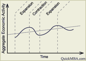
This graph is better explains the business cycle. The parts of the graph are clearly labeled with the correct economic terms, such as peak and trough. The graph is very clear and to the point. This graph was a good contender for the award, however just did not make the cut. With a few more bells and whistles, this graph could have won; however I would like it to be clear that this graph does explain the business cycle very well.

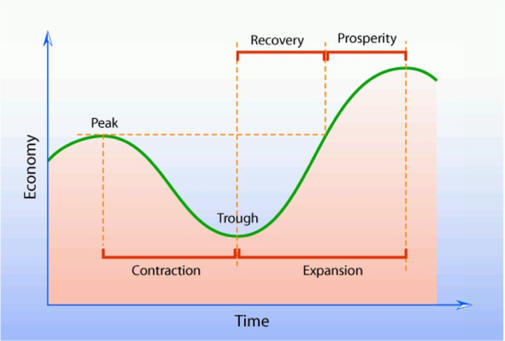
I have to award this graph the title of Best Business Cycle Graph because in addition to using all the correct terms, this graph just goes above and beyond. The colors and dotted lines just make the graph more detailed and easier to understand. It not only includes the four normal vocab words, it goes above and beyond to include other words to help the person understand the business cycle. I applaud this graph.

No comments:
Post a Comment